

THE PUNK ETHOS IS DRIVING THE NEXT TECH REVOLUTION – DATA VISUALIZATION
by Benito Vila, April 27, 2018

School of the Abyss (detail) ; Steve Miller–as described by Miller: The lower fish are piranha; that’s me holding a Amazon River fish. I’ve screened them onto surfboards, to get the environmental “Health of the Planet” conversation “out there”.
Early punk zines were all about sharing information about cool stuff with your peers. The same kids who grew up with this DIY ethos are now the pioneering artists and technologists using Data Visualization to share cool and interesting information, which will change the way we live and may banish “fake news” forever
The reach of Punk goes far beyond music and style. Indeed, the “kids” who took Punk to heart in the 1970s are now leaders in the design and art worlds, and are still challenging what they’re being told.
The profession, or the playing field, that now attracts such attuned people–who are unwilling to accept the status quo–is called “DataViz”. This is where journalists, techies and artists are visually deciphering all the data being collected by our electronic devices. They’re providing us context so that the tonnage of data we amass daily “speaks” to us clearly and in a way that is accessible and inviting. It’s a fundamental change that’s happening now, and it’s definitely cool.
The two words utilized by scientist and marketers to describe a fundamental change are “paradigm shift.” That is what is at work when America goes from listening to Peter, Paul and Mary and Jan & Dean one day to The Beatles and Bob Dylan the next. Such moments signal a fundamental change. And, after that, America quickly moved on to The Rolling Stones, Cream, The Velvet Underground and The Who.
That’s the thing about a paradigm shift: everyone gets it, and fast. We’ve seen it in music and in sports–think how basketball players seemingly all of a sudden started wearing longer shorts in the late 1980s–and in societal standards–where body art (read: tattooing, piercings, etc.) is now more the norm than not.
In 2018, we are living through a paradigm shift when it comes to technology–we’ve collectively evolved from having fold-up, push-button mobile phones in 1997 to now having flat, touch-screen mobile computers that can photograph, record and organize every aspect of our lives.
It took more than two decades for electricity to make it to half of the households in America, and it took more than a decade for color television to reach the same threshold. It took smart phones less than five.
And that’s what’s cool: data.
Data appears everywhere–in charts and graphs in media and business–and even in our language (ever say, “download” or “input”?). That’s the paradigm shift: data points are fast becoming the preferred means of intelligent, articulate communication in journalism and business. And the visualization of data is the “hook”, the means of bringing “the audience” in.
Newspapers and magazines put tremendous resources into such visualizations. Both The New York Times and The Economist–steadfast proponents of “serious” international journalism and long-time industry leaders–staff sophisticated graphics departments that release charts daily to provide insight on everything: from which corporations oppose President Trump’s proposed tariffs to how assault weapons are being distributed.
Unfortunately, those two publications limit the re-use and reprinting of their data and their staff’s visualizations. You’ll have to go there to find them–economist.com and nytimes.com–and you’ll have to pay for the pleasure of their content.
Fortunately, other media sites aren’t so rigid and the journalists, technologists and artists who are leading this change aren’t either; in fact, they’re glad to talk and glad to post what they’re learning. [At the end of this story, explore the links provided to sites and people we like who are telling stories and teaching us this way.]
One of these pioneering leaders is Simon Rogers of Google’s News Lab, who has long connected the birth of punk music to the emergence of data journalism. In making that connection, Rogers cites the British punk fanzine Sideburns as visually providing all the instruction needed for forming a band with Rogers describing punk as “empowering, because anyone could do it.”
A well-regarded industry expert–the creator of The Guardian’s data resource and Twitter’s first data editor–Rogers is humble in insisting, “Data visualizations have always been with us, certainly for centuries, rather than just years. Just look at what Florence Nightingale did around the deaths of soldiers, or the visual representations of slave ships that became such a key part of the abolitionist cause. I think the impetus right now is around trust. The media is less trusted than, arguably, at any time in modern history, so what would we trust? Data, it turns out. Facts are the best response to lies and misinformation, and we have never had such a lot of access to data from around the world.”
A well-regarded industry expert–the creator of The Guardian’s data resource and Twitter’s first data editor–Rogers is humble in insisting, “Data visualizations have always been with us, certainly for centuries, rather than just years. Just look at what Florence Nightingale did around the deaths of soldiers, or the visual representations of slave ships that became such a key part of the abolitionist cause. I think the impetus right now is around trust. The media is less trusted than, arguably, at any time in modern history, so what would we trust? Data, it turns out. Facts are the best response to lies and misinformation, and we have never had such a lot of access to data from around the world.”
In describing the drive to accurately express detailed information, Rogers added, “We need to see it, to visualize it, to understand it. We understand visuals way before we learn to read or write and when there’s a lot of numbers in the air, we need to see them visually to comprehend them. Data visuals can be exciting; they can show us things in ways that make abstract concepts reality.”
Another pioneer, “advance imaging” artist Steve Miller–who creates by way of x-rays, scientific measurement tools and complex data sets–talks about paradigm shifts and data visualizations in another way saying, “In the Renaissance, we went from Byzantine flat imagery icons to Giotto and mathematical perspective. All of a sudden there’s a shift, with the representation of reality getting scientific. At the same time, there was a serial reproduction of molding for decorative details in palaces. In that, you have the start of mechanical production of aesthetics.
We get that same kind of shift again when we go from photography–which marginalizes representation and allows for abstraction–to film. Things speed up again when we get to the Internet, and again when we get to mobile. Now, we are in this next paradigm shift, which has already happened, which is the world of data.”
An avowed “science geek”, in 2001 Miller began using data in his artwork as part of his collaboration with chemist Rod Mackinnon, creating a visualization of Mackinnon’s research on protein structures–how potassium ions move through cell membranes. That research earned Mackinnon the 2003 Nobel Prize in Chemistry and provided the medical community the data needed to better understand cell behavior in the cardiac, nervous, skeletal and pancreatic systems.
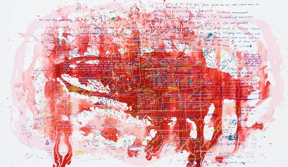
“Booming Demand”, 2012; Steve Miller; dispersion and silkscreen enamel on canvas—visually combining calculations and diagrams to abstractly represent the dimensionality of proteins moving across membranes.
Miller’s creative work has since led him to a long-time documentation of the Amazon jungle, a project called “Health of the Planet”, and to CERN, the European Organization for Nuclear Research, the birthplace of the World Wide Web and the locale of the Higgs boson “discovery” [The Higgs boson particle unifies many aspects of modern physics and has been called “the God particle”.]
At CERN, during the Higgs boson particle accelerations in 2012, Miller had an epiphany on data, declaring, “It was a Snowden thing [referring to Edward Snowden, the CIA employee who confirmed the existence of wide-spread collusive international government and telecommunication company-led surveillance programs]. My phone knew where I was, as did Google. I was–and always am–creating a map of what I’m doing, and what my preferences and interests are; I am creating a lot of data. It’s like the Higgs boson, where the scientists were analyzing the data of literally billions of collisions per second and having to figure out which data is significant. It’s our collective and individual understanding of which data is important which are the book ends between macro and micro experiences; there’s no way that art or aesthetics can be devoid of this lens. It doesn’t mean data is the answer, but it’s certainly the new lens.”
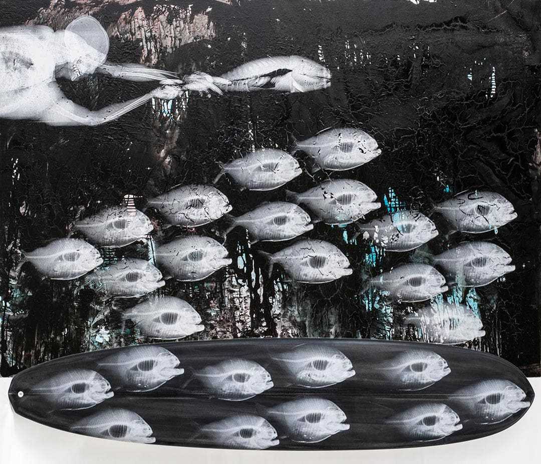
School of the Abyss; Steve Miller–as described by Miller: The lower fish are piranha; that’s me holding an Amazon River fish. I’ve screened them onto surfboards, to get the environmental “Health of the Planet” conversation “out there”.
Miller has been looking through that lens for more than a decade in his “Health of the Planet” series, a creative data visualization originating from his notion that if the Amazon were the lungs of the planet, he could x-ray the flora and fauna and do a metaphorical check-up of the world’s health. He’s done x-rays of piranhas, plants and layered maps revealing land usage patterns and is clear about his findings: “You can understand through data what the environmental crisis is all about; there’s the evidence–the data–and there’s the visualization of the data. Most people get it, except for a few idiots in the U. S. government–complete clowns, who have no idea of scientific method.”
Miller ardently believes massing and mapping data enables our society to understand what’s actually going on, explaining, “We ‘see’ that in politics already, because all political campaigns now are run on data. Obama’s ground plan was based on understanding voter numbers and getting votes in specific locales; now the Republicans are trying to do in redraw districts so that they can better leverage their numbers. It’s a really important moment in time; everything is about data and making use of it. Right now, I’m collecting data on the environmental catastrophe and visualizing it. I’m also using data collection as the basis of a company I’ve founded called Arternal, where we’re connecting art galleries and art buyers; it’s a different sort of map, one that correlates art data and syncs it where art money is flowing.”
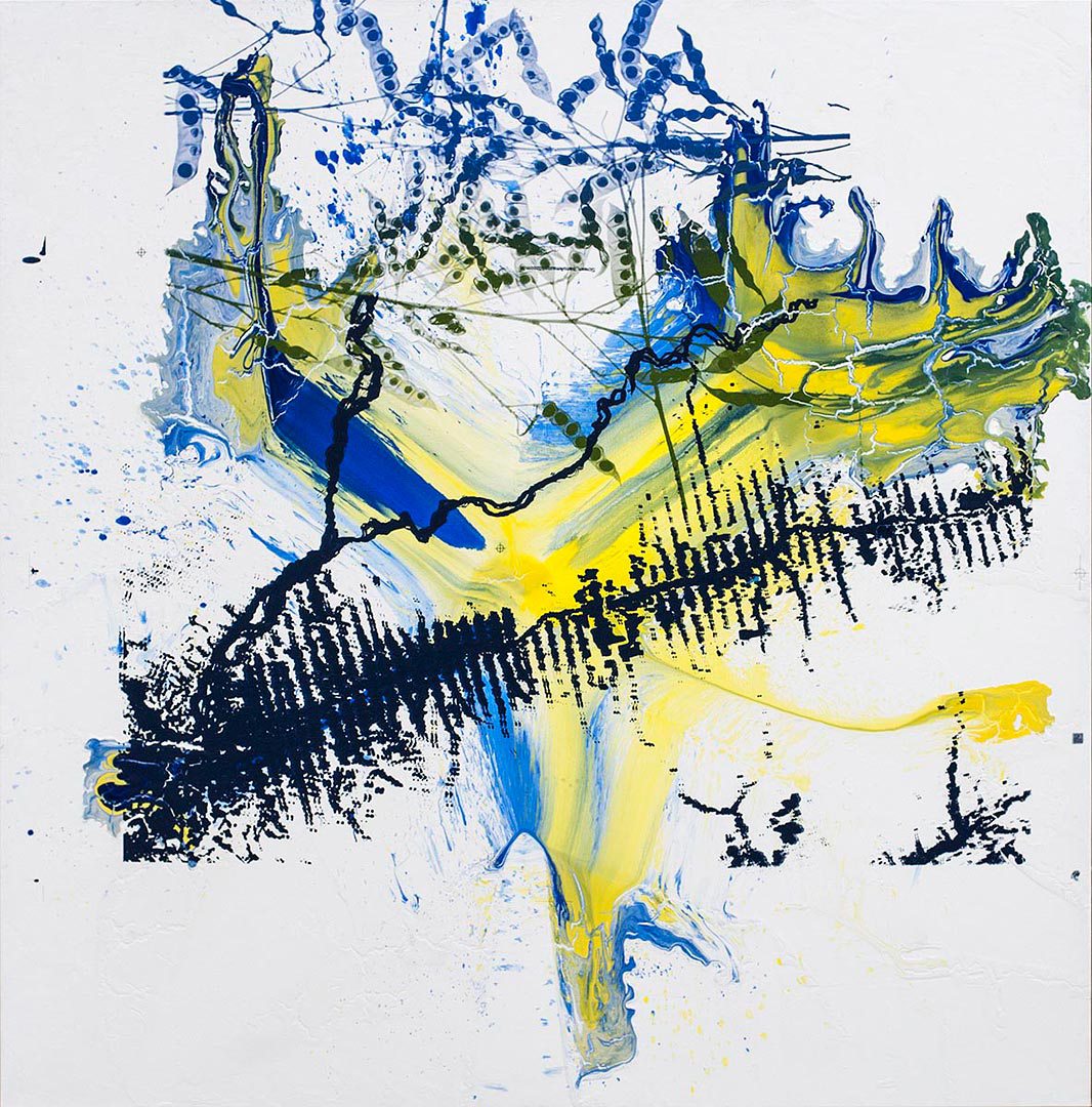
“Kaleidoscope”; Steve Miller–As described by Miller: This is an aerial map of a water system; it’s called “a fishbone”. They put a road in and they clear as wide as they can from the road, and then they go deeper. They go perpendicular, to build another road, then perpendicular again. That’s what it looks like to deforest.
To Rogers, improving the health of political and financial ecosystems through visualization is of paramount importance, noting, “My work is teaching me to make information accessible, to democratize it. There’s no point producing work that no one understands. Good data visuals can help us understand society in all its glory and failures. If we want to make things better in the world, we need to make sense of it.”
When asked what he would like to visualize most, Rogers responded with: “Search data is an incredible window into the brain of the world. Our hopes, our desires, our interests–it’s all hidden in there. It’s the ultimate honest dataset.”
Read the original article at pleasekillme.com